
Green Air · Brand guidelines · v2.0
A breath of fresh air, by design.
How Green Air Home Solutions looks, speaks and shows up — for everyone creating on behalf of the brand.

Air in motion.
The symbol is a flag caught in moving air, drawn in its most minimal form: six offset bars rippling like fabric in a breeze.
Read differently, it forms two letter Es — the double “ee” in Green — and stands for Electrical Efficiency, the focus behind every heating, cooling and hot water system we install.
- Keep clear space equal to the height of one bar on every side.
- Use the full lockup wherever space allows; the symbol may stand alone as an app icon or favicon.
- Minimum width: 120px on screen, 30mm in print.

The flag, on its own.
For favicons, app icons and social avatars, the flag is used without the name. On Green Air green, the flag is always white.


96px
64px
32px
16px
Don't stretch or skew
Don't recolour the bars
Don't add shadows or outlines
Don't place on busy photos
Primary typeface
Aa
Neue Haas Unica W1G
ABCDEFGHIJKLMNOPQRSTUVWXYZ
abcdefghijklmnopqrstuvwxyz
0123456789 % $ °C
A clean, neutral grotesque with warmth in its curves — the same family used in the wordmark. It keeps every message clear and confident.
Display
Medium · 64–96px · tight leading
Headline
Medium · 32–48px
Body
Regular · 16–18px · 1.7 line height
Label
Semibold · 11px · uppercase
Fallback on the web: Manrope, then system sans-serif.
Neue Haas Unica W1G is the intended brand typeface. Its licensed font files are not bundled here, so this specimen uses the fallback wherever the font is unavailable. Obtain the appropriate web, desktop or production licence before distribution; a logo image does not supply a font licence.
Weight & emphasis
Use regular for long reading and medium for headings. Reserve semibold for short labels and actions. Avoid simulated bold or italic styles and do not condense the lettering.
Spacing & readability
Keep letter spacing neutral. Use generous body line height and comfortable paragraph lengths. Let words wrap naturally and never shrink essential copy just to make a layout fit.
Numbers & notation
Use consistent units: °C for temperature, kWh for energy and CAD for monetary context where needed. Distinguish a percentage range from a guaranteed result and keep qualifying notes legible.
Mostly white and open, with Green Air green used boldly where it matters.
Green Air
#00E56B
Primary brand colour. Buttons, highlights, data bars.
Forest
#0F2A1F
Deep backgrounds, footer, statistics panels.
Ink
#111111
Logo lettering, headlines, body copy.
Sage
#9DBFA4
Secondary accents on dark surfaces.
Mist
#F0F5F1
Soft section backgrounds and panels.
White
#FFFFFF
Primary page background. Fresh, open, airy.
Suggested balance: 60% white · 15% mist · 12% green · 8% forest · 5% ink.
#00e56b is the authoritative primary digital brand colour. Supporting swatches describe the palette’s roles; exact output varies with screen, material and print process. Use the current website theme for digital implementation and approved physical proofs for production. Keep white as the principal page background, not a predominantly dark canvas.
Light lines, open shapes.
Outline icons with a 1.5–2px stroke and rounded ends, echoing the soft movement of the logo bars. Use green for emphasis only.
Consistent construction
Use one outline family with consistent stroke weight and rounded joins. Start from a 24px grid and retain recognisable shapes at small sizes. Do not mix filled, 3D and outline styles.
Function before decoration
Use familiar symbols for phone, navigation and service categories. Add a readable label when an icon could be ambiguous. The brand flag is a signature, not a substitute for a menu or control.
Accessible controls
Interactive icons need an accessible name and visible keyboard focus. Use a tooltip for unfamiliar tools and a generous touch target. Decorative icons should not interrupt screen-reader reading order.
Fresh air
Every system we install should make a home feel lighter, cleaner and easier to breathe in.
Electrical efficiency
We favour efficient, electrified heating, cooling and hot water that use less energy for the same comfort.
Rooted in BC
A Burnaby team serving Metro Vancouver and the Fraser Valley, built for local homes and local winters.
Honest expertise
Certified technicians, clear quotes and straightforward advice, before any work begins.
Translate the pillars into action.
Fresh air means clear language and open imagery. Efficiency means explaining the right measure, not simply promising lower bills. Being rooted in BC means naming real local context. Honest expertise means explaining options, limitations and next steps.
Values are not unverified claims.
Support credentials, service coverage and performance statements with current business evidence. The pillars guide behaviour and communication; they do not establish a certification, health benefit or guaranteed energy outcome.
Clear, not technical
Explain what a system does for your home before how it works.
“A heat pump keeps you warm in winter and cool in summer.”
“Our inverter-driven ASHP delivers variable-capacity conditioning.”
Calm, not pushy
Comfort is the goal. Give people space to decide.
“Let's look at what suits your home.”
“Act now — limited-time offer!”
Honest, not overpromising
Keep rebates and savings conditional and sourced.
“Eligible homes may qualify for up to $13,000.”
“Get $13,000 back guaranteed.”
Comfort, inspired by nature.
Service & support
Acknowledge the problem before offering a solution. Ask about symptoms and current equipment. Describe the next step and current availability without implying immediate emergency attendance.
Sales & estimates
Lead with suitability for the home rather than the most expensive product. Prefer “Request an installation estimate” or “Arrange a diagnostic visit” over vague “Get started” wording. Avoid urgency that is not genuine.
Editorial style
Use Canadian English, short paragraphs and sentence case. Write directly to “you” and “your home”. Explain abbreviations on first use; avoid buzzwords, exaggerated superlatives and unsupported “best” claims.
From the forest to the living room.
Real products in real British Columbia light: sunny forests, mountains and blue skies, moving gently indoors to bright, natural homes. Never staged-looking, never dark or dramatic. Every image should feel like fresh air.
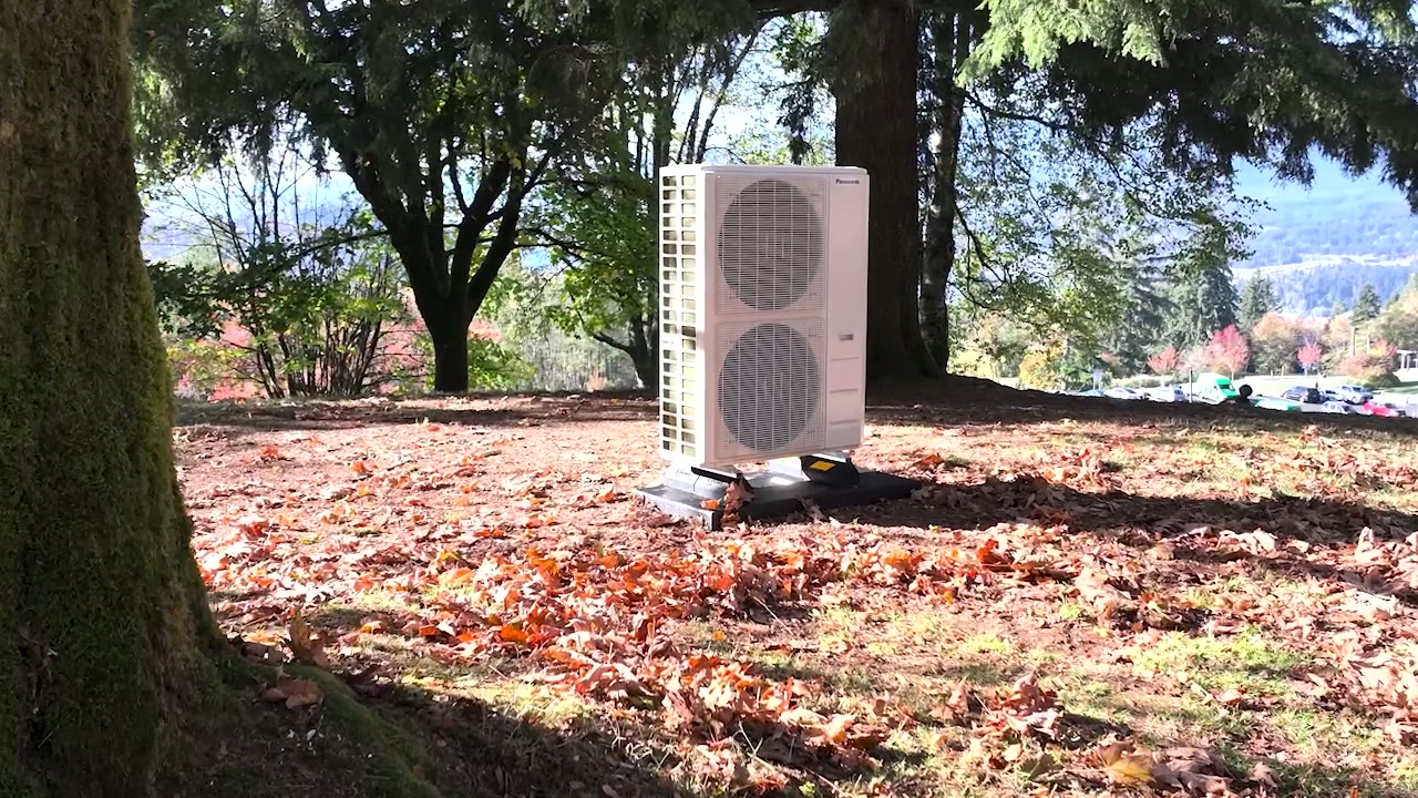
Forestry
Products set in lush BC forest clearings.

British Columbia
Coastal mountains and evergreen horizons.

Naturalism
Soft daylight, natural materials, honest homes.
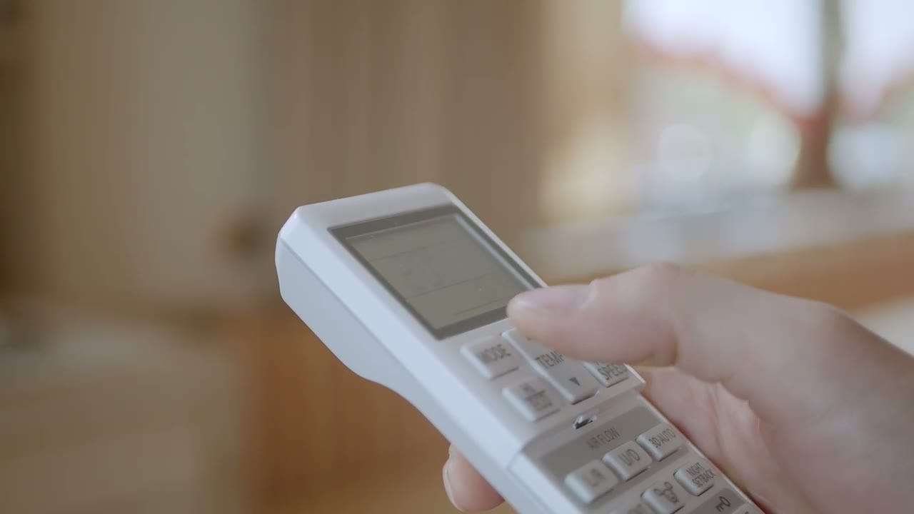
Fresh air
Open, airy spaces that feel easy to breathe in.
Subject accuracy
Match the photograph to the service: a heat pump for heat pumps, a furnace for furnaces, a tankless unit for tankless water heating. People and interiors support the story but must not replace the product where inspection matters.
Light & colour
Choose daylight, lush greens and blue-sky conditions. Preserve believable product finishes and skin tones. Avoid heavy filters, gloomy woodland scenes, artificial neon casts and oversaturated foliage.
Composition & crops
Keep the equipment recognisable and leave a quiet area for bottom-left copy. Review wide and upright crops separately so the product, faces and important details survive each placement.
Real source material
Use supplied footage, approved stills and genuine service photography. Do not introduce AI-generated product or lifestyle photos, or composite an installation that could be mistaken for completed customer work.
Indoor transition
Move from evergreen landscapes to living rooms, bedrooms and kitchens with natural light and honest materials. The visual connection is openness and calm, not a claim that every system purifies the air.
Rights & description
Confirm permission to publish images, especially identifiable customers and homes. Write alternative text for meaningful images and keep decorative backgrounds out of the reading order. Never label a concept scene as a customer installation.
The identity, out in the world.
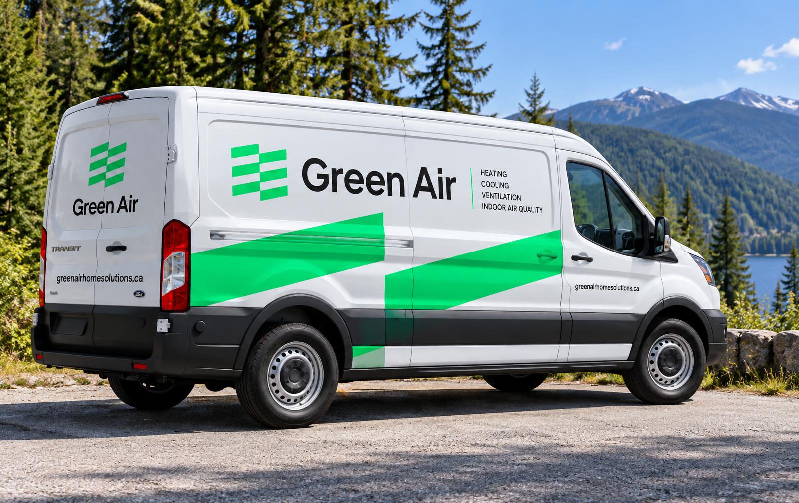
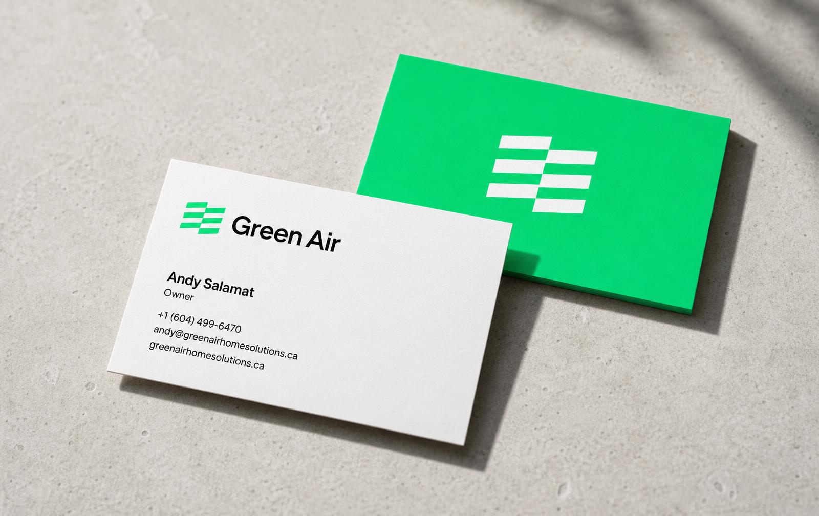
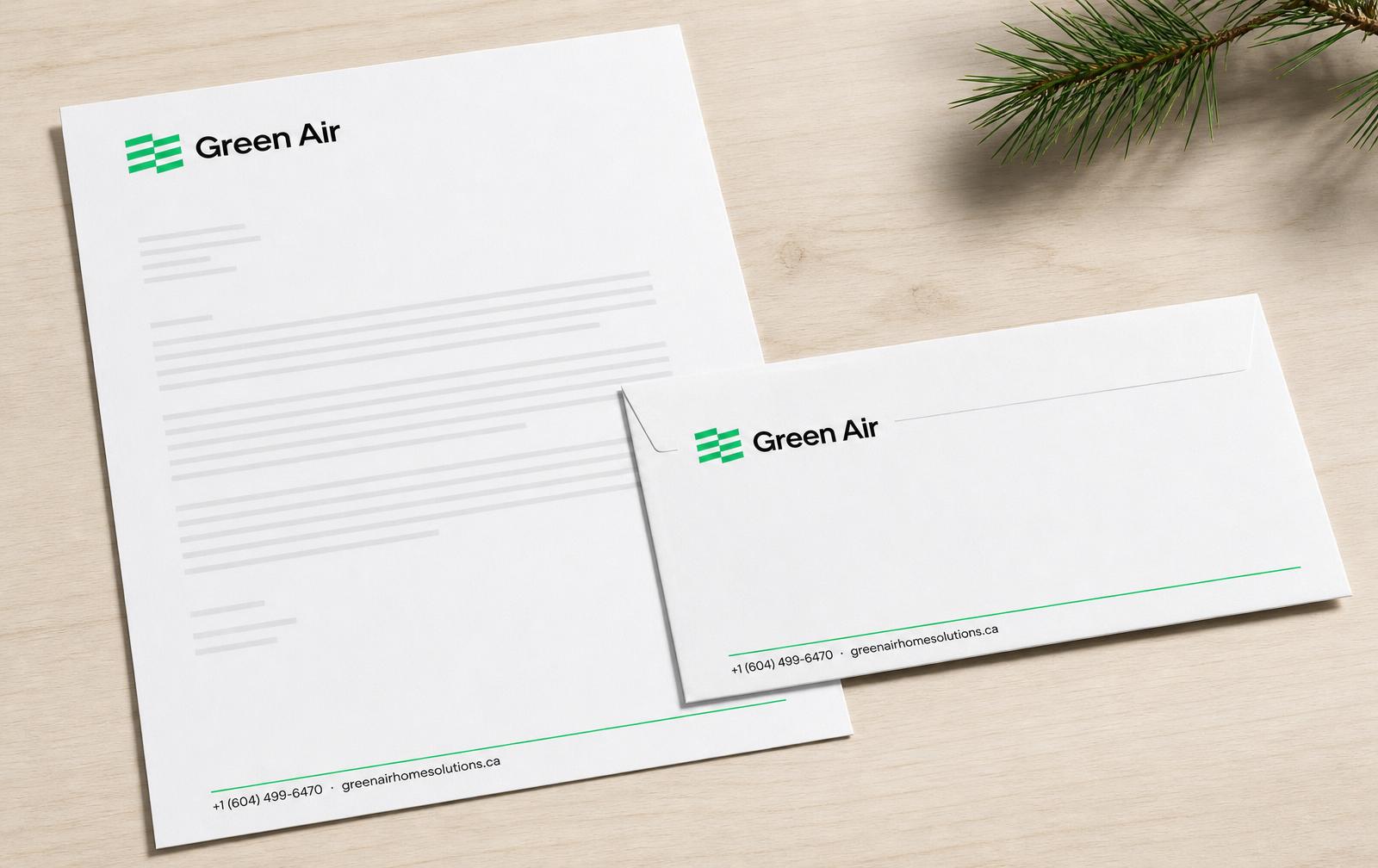
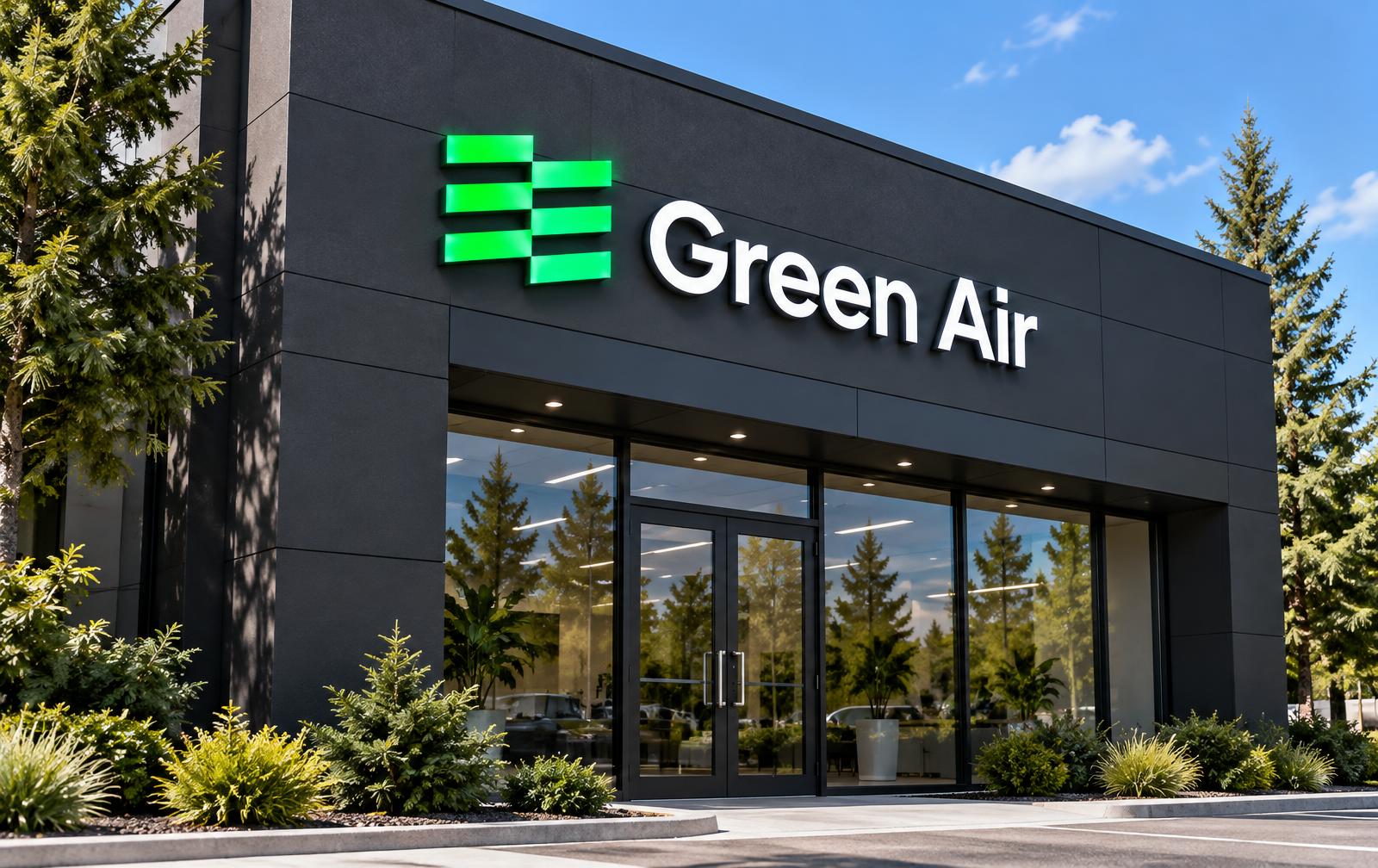
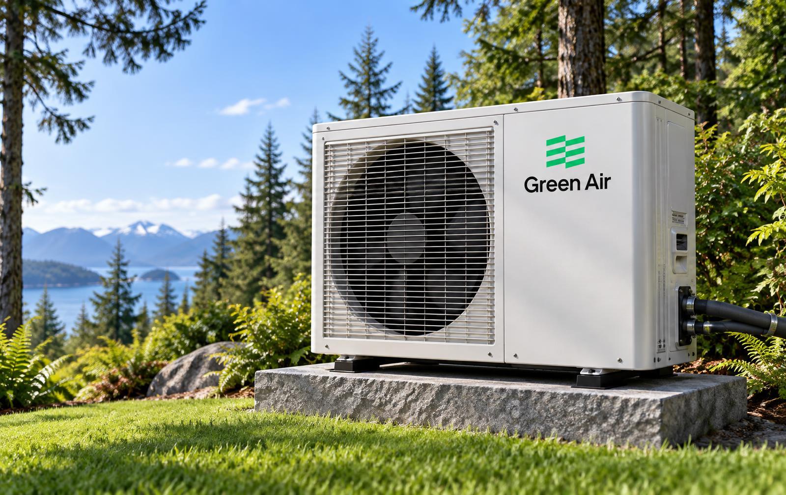
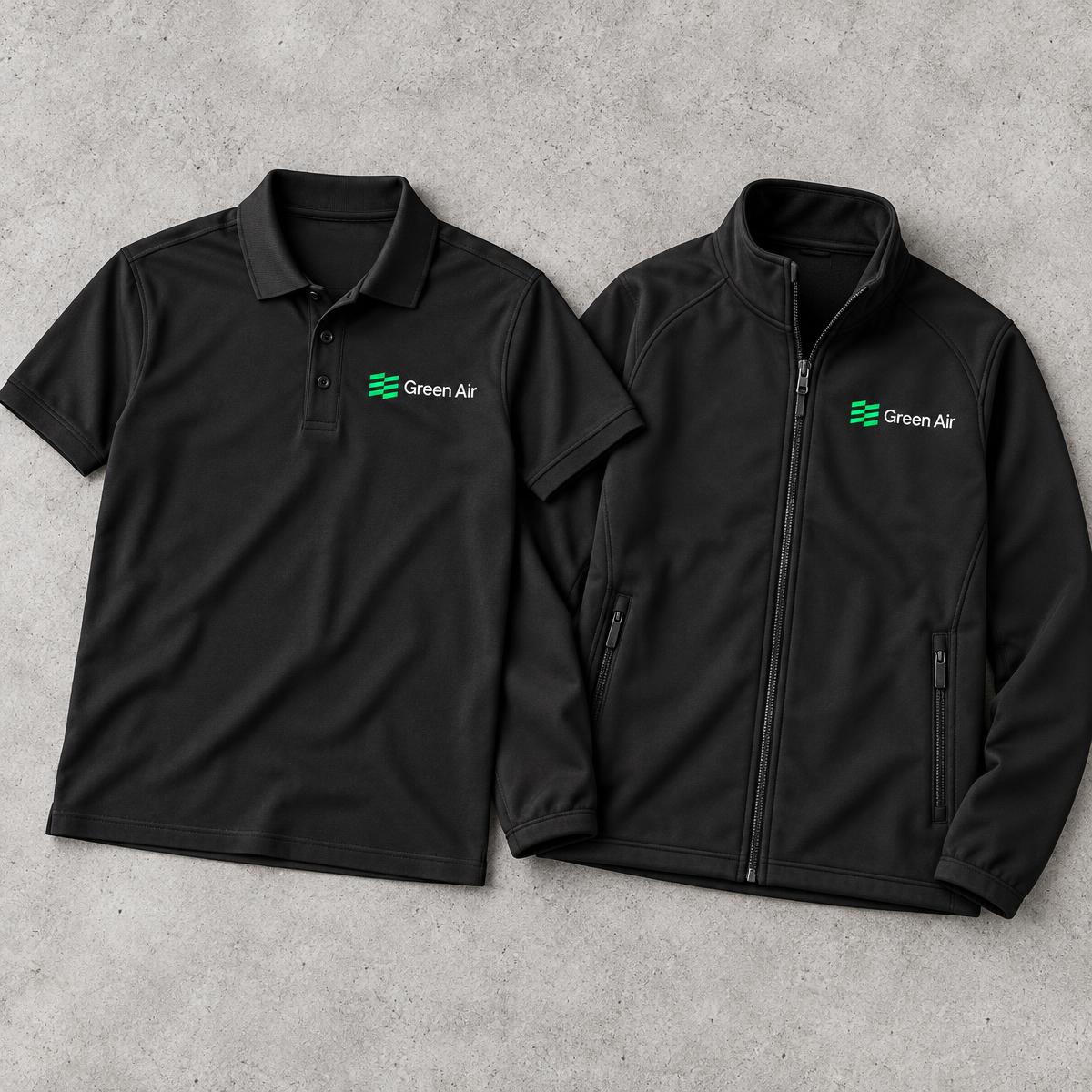
Concept renderings showing how the logo, flag and #00e56b green carry across vehicles, workwear, signage, equipment and stationery. These are design visualisations, not photographs of existing fleet, premises or installations.
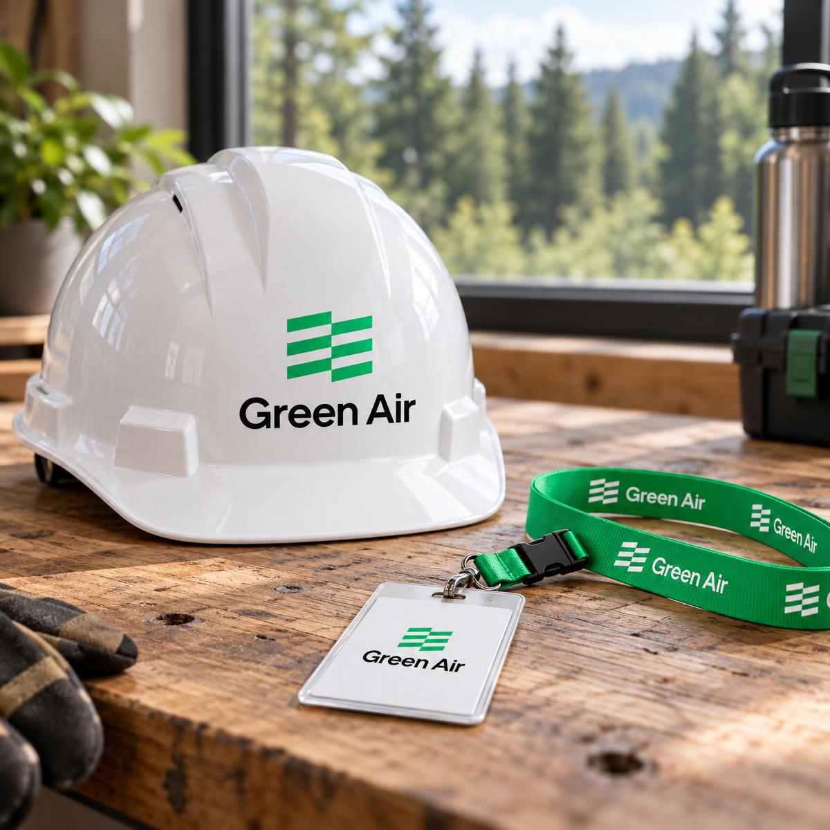
Nature is the inspiration.
Comfort is the outcome.
Green Air connects the freshness of British Columbia’s natural landscape with the everyday experience of a comfortable home. The identity brings technical clarity and human warmth together: capable without being cold, environmentally aware without making unsupported promises.
Purpose
Make heating, cooling and hot water feel understandable, approachable and connected to daily life. Lead with the homeowner’s needs, then explain the equipment and options.
Positioning
A local home-comfort brand rooted in British Columbia. Communicate efficient systems, thoughtful advice and a clear path from assessment to installation or care.
Audience
Homeowners comparing an upgrade, families dealing with a breakdown and people considering electrification. Respect different budgets, existing equipment and levels of technical knowledge.
Personality
Fresh, grounded, capable and considerate. Combine generous white space and direct language with real equipment, familiar homes and recognisable BC landscapes.
Brand signature
Use “Comfort, inspired by nature.” as the signature line. It expresses the brand’s point of view; it is not a technical performance or indoor-air-quality guarantee.
The EE story
The flag suggests air in motion and the double “ee” in Green. Electrical Efficiency is its conceptual meaning, not a certification badge, energy rating or measured product specification.
One identity. The right asset for each surface.
Always start with the supplied artwork. The flag’s staggered bars, the space between them and the relationship to the wordmark are part of the identity. Do not redraw, typeset or automatically trace a replacement.
Full wordmark
Use the complete Green Air logo for website headers, quotations, business documents and first-contact communications. Preserve its original proportions and keep the surrounding area free of copy, borders and competing marks.
Standalone flag
Use the isolated flag where the brand name is already established or space is constrained: a browser tab, app icon, social avatar or small repeat signature. It does not replace the wordmark at first introduction.
Background selection
On brand green, use the white flag. On forest, use green where contrast is clear; on black, use white; on white, use black. Choose an approved logo variant rather than changing individual bars.
Transparency
Digital logo files must remain transparent around the artwork and inside letter counters and the flag’s negative spaces. Check for unwanted white boxes on both light and dark backgrounds.
Sizing & export
Keep the full logo at least 120px wide on screen or 30mm in print. Use the isolated flag for smaller placements. Export from the highest-quality supplied original; do not enlarge a small raster file for signage.
Print hand-off
Supply the original artwork and colour reference to the printer. Request a physical proof for vehicles, uniforms and signs. A screen hex value is not a verified CMYK or spot-colour specification.
Favicon & app icon
Centre the white flag on a solid Green Air green field. Keep generous equal margins; the flag should occupy about half the canvas width. Check the 16px browser-tab view and the larger home-screen view independently.
Social & partner marks
Keep essential artwork inside a central safe area so circular avatar crops do not cut off the bars. Place manufacturer or programme logos separately, using their own guidelines and only with permission.
Fresh colour. Clear communication.
Dark text on brand green
For prominent actions, highlights and short messages.
Light text on forest
For footer information and focused data sections.
Text contrast
Check final foreground/background pairs against WCAG AA: at least 4.5:1 for normal text and 3:1 for large text. Avoid small bright-green text on white and white body text on bright green.
Meaning beyond colour
A green bar is not enough to explain a result. Include a number, unit and readable label. Pair success and error colours with plain-language messages and a recognisable symbol.
Focus & interaction
Keyboard focus must remain visible on white, green and forest surfaces. Check links, input borders and focus indicators against adjacent colours; essential non-text indicators need at least 3:1 contrast.
Photography overlays
Place words on a quiet part of the frame and check every video shot. Use a restrained dark overlay when needed for readability, without obscuring the equipment or changing the fresh daylight direction.
Support colours
Mist separates content gently; sage supports secondary information on dark surfaces. Neither should compete with the primary green or become the default colour for important body text.
Final checks
Review content in bright light, at increased text size and without colour cues. Colour balance is a creative guide, not a reason to sacrifice readability or hide essential information.
Open space. Purposeful structure.
Page rhythm
Keep the main canvas white. Use full-width editorial bands, clear section headings and consistent left alignment. Alternate spacious storytelling with compact, scannable service and data content.
Headline hierarchy
Give each page one clear primary heading, then organise the story with descriptive section headings. Keep headlines short, sentence case and free of exaggerated claims. Do not use all capitals for long passages.
Cards & information bars
Use boxes for repeated statistics, service choices or genuinely framed forms, not every page section. Keep comparable cards aligned and their labels consistent. Brand-green bars should carry a clear scale and meaning.
Calls to action
Place photographic headline and action groups toward the bottom left. Give each decision point one primary action. Distinguish a free installation estimate from a repair diagnostic visit rather than promising the same offer for both.
Forms
Ask only for information needed for the next conversation. Use visible labels, clear required fields and helpful errors. Explain what was received after submission; never imply an appointment is confirmed when it is only a request.
Small screens
Stack content in reading order, preserve the product subject and let long labels wrap naturally. Keep navigation readable and the menu icon plain. Avoid squeezing the desktop layout into smaller, illegible boxes.
Evidence earns the emphasis.
Efficiency, energy savings and cost savings are different measures. Treat them as different stories. A useful number has a definition, a comparison and a source — not just a large percentage.
Efficiency
Explain the measure and operating conditions. A heat pump coefficient of performance is not directly interchangeable with a furnace’s seasonal efficiency rating. Do not present different metrics as a single ranked score.
Energy & cost savings
State the baseline equipment and what is being measured. Lower electricity use is not automatically the same percentage reduction in a household bill; rates, climate, controls and installation affect the result.
Sources & dates
Identify the publishing organisation and link to the source near the figure. Record the date checked. Label industry research as industry research, not Green Air customer performance.
Rebates
Use conditional language and current programme details. Explain eligibility, equipment and application requirements where relevant. Do not turn a maximum rebate into a guaranteed entitlement.
Charts & bars
Use a consistent baseline for true comparisons. State units and denominators; distinguish ranges from single values. Do not use a decorative bar to imply a measured percentage or rating.
Environmental language
Describe a specific, supported benefit rather than claiming a product is universally green, carbon-neutral or pollution-free. Avoid implying that heating or cooling equipment guarantees healthier indoor air.
Movement, like a gentle current.
Motion follows the flag’s idea of moving air: quiet, continuous and controlled. It should add a sense of freshness while leaving the message and the product easy to understand.
Film sequence
Move from the outdoor equipment and forest setting to a clear technical moment, then the Vancouver mountains and trees. Use gentle transitions and natural pacing, not abrupt flashes or rapid zooms.
Silent backgrounds
Background footage starts muted and remains secondary to the page’s content. Select a useful still image for loading and reduced-motion states. Never depend on playback to communicate essential information.
Inclusive playback
Respect reduced-motion preferences and offer a pause mechanism for continuing motion where required. Informational video with speech needs captions; avoid flashing effects and large parallax movements.
The original flag stays intact. Do not animate its bars into a different symbol or distort the wordmark.
Recognisable at every scale.
Website & landing pages
Use the full logo in the light header, white page backgrounds and green primary actions. Match each service image to the actual equipment. Place qualifying detail close to savings and rebate claims.
Social & campaigns
Lead with one idea, one real image and one action. Use the isolated flag for the avatar and the complete wordmark where the brand is being introduced. Keep text away from platform crops.
Vehicles & workwear
Prioritise recognition at distance: logo, a clear service description and verified contact information. Keep artwork away from seams and panel breaks. Proof the green on the actual material.
Quotes & service documents
Use a quiet white layout with the full logo and a clear hierarchy. Distinguish scope, exclusions, pricing and next steps. A brand signature should never compete with practical information.
One flag. One fresh point of view.
Preserve the same identity across digital, print and physical touchpoints.
Before it goes out.
Use this final review for a web page, advert, printed document or new brand asset. Review the actual output, not only the working file.
- The supplied logo is intact, correctly proportioned and free of unwanted backgrounds.
- The flag is white on brand green, with enough room to remain recognisable at the smallest size.
- The primary green is #00e56b, and text, controls and labels remain readable.
- Typography is consistent; Neue Haas Unica is used only with appropriate licensing.
- The message is calm and specific, with one clear next step and no invented business claims.
- Product imagery matches the service and preserves the natural British Columbia direction.
- Statistics have a source, date, unit and relevant conditions; rebates are not guaranteed.
- Links, contact information, form outcomes and final crops have been checked.
- The final piece works at its real viewing size, with keyboard access and reduced motion where relevant.
Comfort, inspired by nature.
Planning a new system? Start with a free installation estimate. For a repair, contact our team to discuss a diagnostic visit.